
A logo is often the first visual interaction people have with a brand. It is more than just an attractive design; it acts as a symbol of trust, recognition, and identity. To understand what’s truly “in a logo,” we must look at its definition, its historical evolution, and how it connects with broader brand identity.
At its core, a logo is a graphic mark, emblem, or symbol designed to identify a brand. It distills the essence of a company into a single visual element, whether it’s text-based, symbol-based, or a combination of both.
The primary purposes of a logo include:

Think of Apple’s bitten apple, Nike’s swoosh, or McDonald’s golden arches — each is a simple yet powerful representation of what the brand stands for.
Logos aren’t a modern invention; they trace back centuries. Early civilizations used symbols, crests, and seals to signify ownership, authority, or craftsmanship. For example:
In the 20th and 21st centuries, logos evolved into a strategic branding tool. Design movements such as Bauhaus minimalism and Swiss modernism influenced the rise of clean, simple, and scalable logos. Today, logos adapt across digital platforms — from mobile apps to motion graphics — while still carrying the timeless purpose of instant recognition.
A common misconception is that a logo and brand identity are the same. In reality:
Think of the logo as the signature and brand identity as the personality. For instance, Coca-Cola’s logo is its red script, but its identity extends to red-white packaging, jingles, advertising style, and global campaigns.
When used together effectively, logos become entry points into the brand experience, while brand identity ensures consistency across every touchpoint. This synergy strengthens recall, loyalty, and differentiation in competitive markets.
Behind every memorable logo lies a blend of design principles and brand psychology. While styles may change with trends, certain components form the foundation of a logo’s effectiveness. Let’s break them down.

Typography gives voice to your brand. A carefully chosen font can express confidence, elegance, friendliness, or innovation:
Typography also determines scalability. A wordmark should remain crisp and legible whether displayed on a billboard or a mobile app icon.
Shapes and symbols are powerful because they communicate without words.
Abstract or custom icons, like Nike’s swoosh, become synonymous with brand identity over time. The key is to create symbols that resonate with your target audience while remaining timeless.
Color is one of the most influential elements of logo design, directly tied to human psychology:
Brands often combine colors strategically — for example, McDonald’s red (excitement) with yellow (happiness). Choosing the right palette ensures the logo aligns with your brand’s emotional positioning.
Sometimes words strengthen a logo’s message:
The right combination depends on your brand’s memorability and communication goals.
The most successful logos balance typography, symbols, and color psychology to create a design that’s:
This holistic approach is what leading design partners, like a top creative agency in Bangalore, apply when developing logos that not only stand out but also stand the test of time.

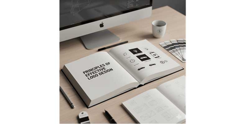
A well-designed logo isn’t just about aesthetics — it’s about strategy. The strongest logos follow a set of universal principles that make them recognizable, adaptable, and memorable.
The most iconic logos are often the simplest. Apple’s bitten apple, Nike’s swoosh, or Twitter’s bird all prove that less is more. Simplicity ensures:
A cluttered design might look interesting but often fails in adaptability and memorability.
A powerful logo works across all mediums and sizes:
Designing with versatility in mind ensures the logo remains consistent in quality and message no matter where it appears.
A logo should align with the brand’s personality, audience, and industry. For example:
Appropriateness ensures the logo communicates the right story to the right people.
While design trends come and go, timeless logos maintain their relevance for decades. Brands like Coca-Cola or Mercedes-Benz have made only subtle refinements over time because their logos were designed to last.
However, being timeless doesn’t mean ignoring trends altogether. It’s about balancing modern touches with enduring qualities so the logo stays fresh without losing recognition.
A logo cannot exist in isolation. It should fit seamlessly into the broader brand identity system — color palettes, typography, brand guidelines, and tone of communication. A cohesive design ensures every brand touchpoint reinforces the same narrative.
When applied together, these principles transform a logo into a strategic business asset rather than just a visual mark. They ensure that the logo:
Businesses that work with experienced designers or agencies often find that these principles form the blueprint of long-term brand success.
Designing a logo is not just about creativity — it’s a structured process that blends strategy, research, and design principles. A strong process ensures that the logo resonates with audiences while reflecting the brand’s vision.
Every logo starts with clarity about the brand’s core essence. Before sketching ideas, it’s important to define:
Without these answers, a logo risks becoming a generic design with no meaning.
The next step is to study the market and competition. A competitive audit helps identify:
For example, in the tech sector, many brands use blue to signal trust. A fresh competitor might explore a different color strategy to stand out.
A well-written design brief sets the foundation for success. It should include:
This document becomes the guiding framework for designers, ensuring alignment with business goals.
Logo creation is rarely perfect in the first draft. The process involves:
Testing ensures that the logo not only looks good but also performs well in real-world applications.
Once the strongest concept is chosen, the designer polishes the details. Deliverables typically include:
This stage ensures the logo is ready for every business scenario.
Following a structured process turns logo design into a business investment rather than an artistic experiment. It ensures that the final mark is:
Brands that skip this process often end up rebranding within a few years, while those who follow it create logos that become timeless symbols of trust and recognition.
Even the most well-intentioned designs can fail if certain pitfalls aren’t avoided. Recognizing these mistakes helps businesses create logos that last, rather than ones that require constant redesigns.
A common mistake is trying to pack too many ideas into one logo. Overly detailed shapes or multiple fonts reduce clarity, making the logo hard to recognize at smaller sizes. Simplicity is key — a logo should communicate instantly, not overwhelm the viewer.
Typography plays a major role in logo design. Choosing decorative or overly stylized fonts may look interesting in drafts but can hurt readability. Logos must remain legible on everything from a smartphone screen to a highway billboard.
Color is powerful, but misusing it can dilute a brand’s identity. Mistakes include:
A thoughtful palette strengthens recognition; a careless one creates confusion.
Trendy logos may look modern today but risk appearing outdated tomorrow. For instance, gradients, 3D effects, or hyper-minimalist fads often fade quickly. While it’s fine to incorporate current styles, relying solely on them can shorten a logo’s relevance.
A logo should perform across platforms — from digital icons to physical merchandise. Designs that only look good in one format (like full color) fail when used in black-and-white or on small devices. Testing adaptability early prevents this risk.
Sometimes brands forget who they are designing for. A luxury brand using cartoon-style typography or a healthcare brand with aggressive colors can create a disconnect. A logo must reflect the brand’s audience expectations and industry tone.
One of the costliest mistakes is creating a logo that resembles an existing brand. Not only can this damage credibility, but it can also lead to legal disputes and rebranding costs. Verifying originality and securing trademarks is crucial before launch.
Avoiding these risks ensures that your logo is:
By steering clear of common pitfalls, brands save time, money, and reputation, while building logos that genuinely resonate with their audience.
A logo’s strength lies not only in its design but also in how and where it is used. Different touchpoints demand different adaptations, and studying real-world examples reveals how logos function across diverse contexts.
These examples show that logos are living assets, capable of evolving while maintaining consistency.
Logos carry different meanings depending on cultural context:
Global brands must adapt while staying true to their identity — for example, McDonald’s adjusts its marketing and color palette emphasis in different regions without changing the iconic golden arches.
The future of logo design is being shaped by artificial intelligence, cultural shifts, and emerging design trends. While timeless principles still apply, technology and audience expectations are redefining how logos are created and experienced.
AI is transforming logo design from a purely manual process into a data-driven, collaborative experience. Tools like Canva, Looka, and Adobe Firefly allow businesses to:
For startups and small businesses, AI offers cost-effective entry points. However, working with experts ensures logos remain strategic and brand-aligned rather than generic.
Modern logos are no longer just visual identifiers — they are ethical statements.
Logos that integrate these principles resonate deeper with modern consumers who value brands with purpose.
Before approving a logo, brands must step back and critically evaluate whether it truly represents their identity and long-term vision. Asking the right questions helps prevent costly redesigns and ensures the logo becomes a lasting asset.
A logo should be more than attractive design — it must reflect who you are as a brand.
If the logo doesn’t clearly tell your brand’s story, it may need refinement.
Logos live across multiple touchpoints:
A strong logo should be scalable, versatile, and adaptable in both digital and physical spaces. Testing in real-world scenarios ensures consistency.
Originality is critical to avoid confusion and legal issues. Brands should confirm:
Skipping this step could lead to lawsuits or expensive rebranding.
Design trends fade, but timeless logos remain relevant for decades. Before finalizing, ask:
A logo designed to last reduces the need for frequent redesigns.
A logo doesn’t stand alone — it’s part of a brand ecosystem. Ensure it fits with:
The more cohesive it feels, the stronger your overall branding becomes.
A logo is more than a design — it’s the face of your brand and a symbol of trust. By focusing on simplicity, versatility, and timelessness while avoiding common mistakes, businesses can create logos that resonate with audiences for years to come. Real-world examples show that the strongest logos evolve without losing their identity, while future trends like AI and adaptive design ensure continued relevance.
At Bud, we craft logos that balance creativity with strategy. Bud also offers digital marketing services including social media marketing, SEO services, PPC services, and web development services. Contact us today to know more about us.
The right logo doesn’t just represent your brand — it helps define its legacy.