

When the number of smartphone and tablet users grows rapidly, it is extremely important to comprehend the significance of mobile SEO for any business, if they want to succeed online. With an increasing number of people using their mobile devices to log onto the web, adapting your site to these devices is no longer a luxury; it is a necessity. If you are partnering with a leading SEO agency in Bangalore, they will help you to optimise your website for mobile users.
Mobile SEO refers to the process of optimizing your website so that it delivers a seamless, user-friendly, and fast experience on smartphones and tablets. In 2025, the importance of mobile SEO is no longer optional—it’s a cornerstone of digital success. With mobile devices accounting for more than 65% of global web traffic, search engines like Google now evaluate mobile performance first when ranking websites.
For businesses, this means a well-optimized mobile site doesn’t just improve visibility—it directly impacts user engagement, lead generation, and revenue. Whether you are running an e-commerce store, a service website, or a content hub, mobile SEO ensures that visitors can find, navigate, and interact with your brand effortlessly.
At its core, mobile SEO is the practice of making your website search-engine-friendly and user-friendly for mobile devices. It goes beyond shrinking desktop content onto a smaller screen—it’s about designing specifically for mobile consumption.
Mobile SEO includes:
Simply put, mobile SEO is the bridge between technical optimization and user experience in a mobile-first digital world.
Google officially rolled out mobile-first indexing globally in recent years, and by 2025 it has become the default ranking system. This means that Google primarily uses the mobile version of your website—not the desktop version—to evaluate content, crawling, and ranking.
Why does this matter?
For brands, the implication is clear: a mobile-friendly site is not just “nice to have,” it’s the baseline for being visible in search.
The shift toward mobile dominance has accelerated every year, and 2025 has set new benchmarks:
These trends show that the way people discover, research, and purchase products is increasingly tied to their mobile experience. Businesses that optimize for mobile can capture this surge in traffic, while those that neglect it risk being left behind.
Optimizing for mobile SEO is not just about pleasing search engines—it’s about creating a smooth, effective experience that resonates with users and drives business growth. From ranking higher on Google to converting casual visitors into loyal customers, the benefits of mobile SEO are multi-dimensional.
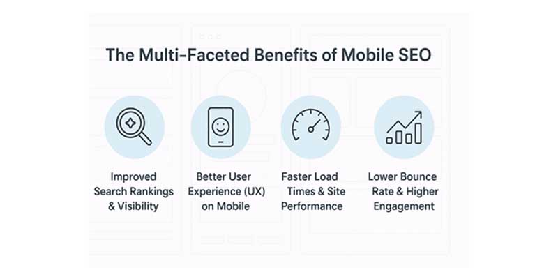
Search engines prioritize mobile-friendly websites. With mobile-first indexing now the default, Google evaluates your site primarily through its mobile version. This means if your website performs well on smartphones, you gain:
In simple terms, mobile SEO directly fuels your search visibility and discoverability in a competitive landscape.
Mobile SEO is inseparable from user experience (UX). A cluttered, hard-to-navigate mobile site frustrates visitors, while a well-structured one keeps them engaged. Key UX benefits include:
A positive mobile UX does more than satisfy users—it builds trust and increases the chances that visitors will return.
Speed is one of the most critical ranking and engagement factors. Studies show that 53% of users abandon a site if it takes more than three seconds to load on mobile. Mobile SEO emphasizes:
When your site loads fast, users stay longer, interact more, and search engines reward you with better rankings.
A site that loads quickly and provides easy navigation naturally reduces bounce rates. Visitors are more likely to explore multiple pages when they don’t face obstacles such as:
With optimized mobile UX, your website keeps users engaged, improving metrics like time on page, session duration, and scroll depth—all signals search engines use to gauge content quality.
Mobile SEO also drives conversions and revenue growth. By designing mobile-friendly landing pages with strategically placed CTAs, you make it simple for users to take action.
When combined with fast performance and clear messaging, mobile SEO turns browsers into buyers.
Now that voice assistants are on the rise, being able to adapt your site for voice searches is also very important. It has become apparent that more people use their smartphones to voice search and for most cases, they use conversational queries. Because of this, by paying much attention to the mobile SEO aspect, your content will be relevant to these conversational search queries, boosting your chances of featuring on voice search results.
Building a mobile-friendly website goes beyond resizing content—it requires a strategic approach to design, speed, and usability. Below are the critical components that ensure your site is not only optimized for search engines but also enjoyable for mobile users.
Building a mobile-friendly website goes beyond resizing content—it requires a strategic approach to design, speed, and usability. Below are the critical components that ensure your site is not only optimized for search engines but also enjoyable for mobile users.
Responsive and adaptive design form the backbone of mobile SEO. Responsive design automatically adjusts layouts based on the user’s screen size, ensuring a seamless experience across smartphones, tablets, and desktops. Adaptive design, on the other hand, delivers pre-set layouts depending on the device type.
Fast-loading pages are a non-negotiable ranking factor. Speed directly influences bounce rates, user satisfaction, and conversion rates. Mobile SEO prioritizes performance improvements that keep pages light and responsive.
Images are often the heaviest elements on mobile pages. To speed up performance:
This ensures visuals remain sharp without slowing down page loads.
Code optimization improves site efficiency:
Regularly audit your site with tools like Google PageSpeed Insights to identify bottlenecks.
Mobile users interact with thumbs, not cursors. This means content readability and tap targets must be optimized:
A frictionless design keeps users engaged and signals high-quality UX to search engines.
Without a proper viewport configuration, your site may appear zoomed-out or distorted on mobile. Setting the viewport correctly with <meta name="viewport" content="width=device-width, initial-scale=1.0"> ensures content scales appropriately.
Flexible layouts further adapt to varying screen widths, ensuring images, text, and containers adjust proportionally—critical for users on both large tablets and compact smartphones.
Pop-ups can frustrate mobile users and disrupt content accessibility. Google penalizes sites that use intrusive interstitials blocking core content. Best practices include:
A clean, distraction-free experience boosts trust and keeps users on-site.
Content must be designed for quick consumption on smaller screens. That means:
When content and navigation are mobile-friendly, users are more likely to stay, explore, and convert.
Implementing Structured Data on mobile pages helps search engines understand your content entities, relationships, and intent—fueling richer results like FAQ accordions, how-to steps, product availability, price, and review stars. In 2025’s AI-mode SERPs, well-formed schema boosts result eligibility for interactive modules and conversational answers.
Best practices:
AI-mode increasingly surfaces conversational answers sourced from pages that anticipate how users speak.
What to do:
While not direct “ranking factors” in isolation, engagement metrics correlate strongly with visibility in modern result types.
Lift these signals by:
Local intent is overwhelmingly mobile. To win:
Speed and interactivity shape mobile outcomes:
Mobile SEO is never a “one-and-done” task. As technology, search algorithms, and user behavior evolve, ongoing testing and optimization are critical. Continuous monitoring ensures your site remains competitive, loads quickly, and delivers the seamless mobile experience that search engines and users expect.
The first step in optimization is identifying usability issues. Tools designed specifically for mobile evaluation make this process straightforward:
Regular testing ensures your site adapts to new devices, OS updates, and browser behaviors.
Site speed is not just about convenience—it’s a ranking factor. Performance monitoring tools help track and optimize critical metrics:
By addressing Core Web Vitals, you improve both rankings and real-world user experience.
Understanding how users behave on your mobile site is just as important as page speed and design. Key analytics to monitor include:
Analyzing these behaviors allows you to fine-tune both design and content for maximum engagement.
Search engines continually refine how they interpret mobile experience—especially with the rise of AI-driven ranking signals in 2025. To stay ahead:
A proactive approach ensures you adapt to changes quickly, protecting rankings and enhancing your competitive edge.
Even with the best intentions, many websites fall short on mobile SEO due to avoidable mistakes. These issues not only frustrate users but also send negative signals to search engines, ultimately hurting rankings. Recognizing and correcting these errors is critical to building a strong mobile presence.
A site designed primarily for desktop users often performs poorly on mobile devices. Non-responsive layouts force users to pinch, zoom, or scroll awkwardly, creating friction. Google’s mobile-first indexing means such designs are penalized in rankings.
How to avoid:
Technical errors and intrusive features can cripple mobile usability:
How to avoid:
Small fonts, cluttered menus, and tightly packed links make mobile navigation frustrating. Users often abandon sites that require too much effort to explore.
How to avoid:
With voice assistants and AI-driven results dominating mobile experiences, neglecting voice optimization and structured data limits visibility. Mobile users frequently issue conversational, long-tail queries, and sites without schema markup miss out on rich snippets.
How to avoid:
Optimizing your website for mobile is a continuous process, but it doesn’t have to feel overwhelming. By following a structured set of steps—from initial audits to measurable performance tracking—you can systematically improve your site’s mobile experience and search rankings.
Before diving into changes, it’s essential to establish a baseline. A structured audit provides the foundation for all optimization efforts.
Steps to take:

This pre-optimization stage ensures you know what’s broken and what success should look like.
Some improvements can be implemented immediately and deliver fast results.
Quick wins deliver visible improvements in performance and usability almost overnight.
For lasting impact, deeper changes may be required. These involve rethinking both design and structure with a mobile-first approach.
These long-term changes make mobile optimization sustainable and scalable as your business grows.
Once changes are in place, it’s vital to measure their effectiveness. Define clear Key Performance Indicators (KPIs) for mobile SEO:
Regular monitoring helps you refine strategies, fix emerging issues, and stay aligned with both user expectations and algorithm changes.
The importance of mobile search engine optimisation in the present day cannot be stressed enough. As more and more people begin to use their mobile devices to access the internet and perform various activities, it has become wise for business entities to focus on matters pertaining to mobile usability. If you accept the advantages named above, use the examples you read in this article and modify your site according to their standards, get some help from the Top SEO company in Bangalore. You will work wonders for its performance and the overall satisfaction of the users, as well as boost your profitability. In an era where time is of great essence, putting your money into mobile SEO is not just smart; it is actually necessary for any online marketing to work. Do not let your competition overtake you in the rankings—start right now!
WE ARE AN OFFICIAL GOOGLE PARTNER