
In the modern online environment, m-commerce has taken the leading position in mobile shopping. With over 60% of all e-commerce traffic now coming from mobile devices, having a responsive Shopify theme isn't just a nice-to-have feature—it's an absolute necessity for business success. The disparity between a mobile-optimized store and one that is not may literally make or break your conversion rates.
The movement to mobile shopping has been nothing less than revolutionary. Customers have come to demand a smooth experience across all their devices, and are actually deciding to buy your products and services on their smartphones and tablets. This shift in behavior implies that any business that is not mobile-optimizing its store is literally closing the door on potential shoppers.
When a customer goes to a site that is not optimized to appear on their mobile phone, they do not sit around and hope that it will improve. Research indicates that 57 percent of users will not recommend a business that has a poorly developed mobile site, and 40 percent of users will shift to a rival company after a negative mobile experience. This is where implementing a responsive Shopify theme becomes crucial for maintaining a competitive advantage.
The behaviour of mobile shoppers is different from that of desktop users. Their attention span is generally shorter, they require less time to load, and they must have easier navigation systems. They are likely to be shopping in short snippets across their day—commuting to work, waiting in line, or lounging at home. This implies that your store must support such fast and impulse-based shopping activities.
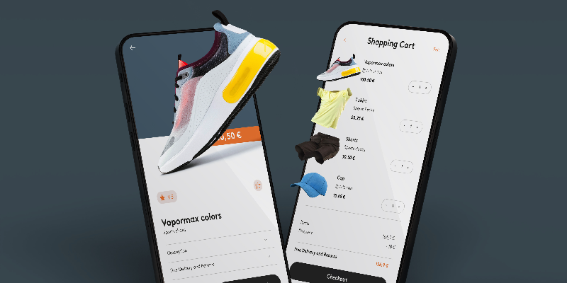
A responsive Shopify theme adapts to these behavioral patterns by providing intuitive touch-friendly interfaces, streamlined checkout processes, and optimized product displays that work perfectly on smaller screens. The best responsive Shopify theme options understand these nuances and are built specifically to convert mobile visitors into paying customers.
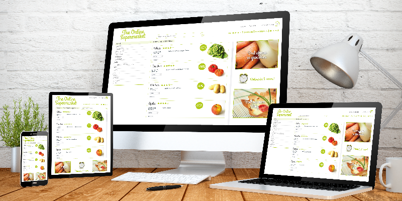
Technically, responsive design is the approach that makes your Shopify store automatically rearrange its layout, images, and features, depending on the device a customer is using. This is not simply a matter of scaling things down— it is a matter of redesigning the whole user experience to the mobile situation.
This has been acknowledged by search engines such as Google, which have adopted a mobile-first indexing strategy, which essentially implies that they will predominantly rely on the mobile variant of your site to rank and index you. This makes a responsive Shopify theme essential not just for user experience, but for search engine optimization as well. Non-mobile-friendly sites tend to lose their positions in search results dramatically, and this factor directly affects the organic traffic and possible conversions.
All these features combine to bring down the cart abandonment rate, which is known to be somewhat higher in mobile devices, where inputting payment details on smaller keyboards can be a complicated affair.
The business impact of implementing a responsive Shopify theme extends far beyond just aesthetics. The companies, which have already optimized their mobile experience, usually gain instant success in terms of vital performance indicators. When the correct responsive design is applied, the mobile conversion rates tend to grow by 20-30 percent, and the bounce rates, in turn, tend to drop drastically.
Another aspect that is likely to increase when companies invest in mobile optimization is customer lifetime value. Delighted mobile customers will have increased chances of coming back to make repeat purchases and referring the store to other customers. This creates a positive feedback loop that compounds over time, making the initial investment in a quality responsive Shopify theme extremely cost-effective.

When selecting the best responsive Shopify theme for your business, consider these essential factors:
Many businesses find value in working with experienced Shopify developers in India who can customize themes to meet specific requirements while ensuring optimal mobile performance. These developers have extensive knowledge of not only the best practices of responsive design but also the capabilities of the Shopify platform.
In the future, the role of mobile commerce can only increase. Mobile-first technologies, such as augmented reality, voice shopping, or progressive web apps, are all technologies that will define the future of e-commerce businesses that establish strong mobile foundations now through responsive Shopify themes will be better positioned to adopt these new technologies as they become mainstream.
The investment in a responsive Shopify theme today is really an investment in your business's future viability. With the consistent growth of mobile technology and the number of consumer expectations rising, a strong mobile-optimized foundation proves to be worth more and more.
The question isn't whether you need a responsive Shopify theme—it's how quickly you can implement one. Mobile traffic has been ruling the e-commerce sphere, and it does not appear to be stopping anytime soon, which means that companies that do not consider mobile optimization are effectively limiting their chances of growth.
The best responsive Shopify theme for your business is one that not only looks great on mobile devices but also converts visitors into customers effectively. When you emphasis responsive design, you are not only enhancing user experience, but you are also having a direct effect on your bottom line by directly increasing conversions, improving search placement, and customer satisfaction.
In the competitive world of e-commerce, a responsive Shopify theme isn't just a technical requirement—it's a strategic advantage that can set your business apart and drive sustainable growth in the mobile-first economy.
WE ARE AN OFFICIAL GOOGLE PARTNER