In the ever-evolving landscape of digital marketing, the importance of responsive design, the need for
mobile-friendly websites, and the critical impact that various web hosting types and services exert on the
overall user experience and conversion rates are inevitable.
According to the results of the survey 'Internet life every day', commissioned by Google and conducted in five countries: Poland, Slovakia, Romania, Czech Republic and Hungary, 67% of the Romanians connected to the Internet use smartphones and mobile phones to connect, and 32% use tablets. Other significant figures are as follows: 61% of the people have a better opinion about brands when they provide a pleasant mobile experience and over 20% of Google searches are conducted from a mobile device. Traffic on mobile devices represents over 50% of the total traffic on the Internet.
Responsive Web Design (RWD) is the practice of building websites that automatically adjust their layout and functionality across different devices and screen sizes. Instead of creating separate versions for desktop and mobile, one responsive framework ensures a seamless user experience on smartphones, tablets, laptops, and large monitors alike.
At its core, responsive design continues to matter because the digital landscape has become mobile-first. With most users accessing the web via handheld devices, businesses cannot afford to offer clunky, desktop-only interfaces. A responsive website not only improves user satisfaction but also aligns with Google’s mobile-first indexing and Core Web Vitals ranking factors.
Responsive web design is guided by three foundational elements:
Together, these principles create websites that are adaptive, accessible, and consistent, no matter the device.
Uses fluid grids and media queries so one layout adjusts to every screen size. It’s flexible and future-proof.
Creates distinct layouts for specific screen sizes (for example, separate templates for mobile, tablet, and desktop). While it offers control, it can be more resource-intensive to maintain.
A design philosophy where websites are built starting with the smallest screen and scaled up for larger devices. This approach aligns with current user behavior and Google’s emphasis on mobile accessibility.
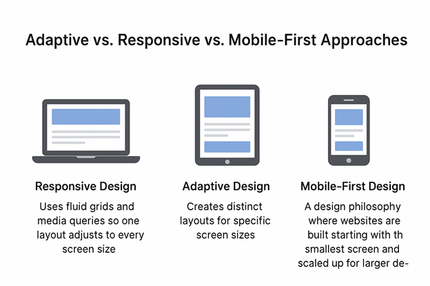
In practice, many modern websites combine these strategies—adopting a mobile-first mindset while leveraging responsive techniques for scalability.
Understanding the importance of responsive design is the foundation of a modern and effective online advertising strategy. It involves the creation of websites that seamlessly adapt and respond to diverse screen sizes and devices. In an era where consumers traverse a digital landscape covering smartphones, tablets, laptops, and desktops, a consistent and user-friendly experience is no longer a luxury but a necessity. Responsive design ensures that a website looks visually appealing and functions seamlessly across all platforms, providing users with a cohesive and engaging experience.
The widespread use of smartphones has revolutionized how consumers access information and make purchasing decisions. Mobile-friendly websites contribute significantly to higher search engine rankings. Search engines prioritize responsive design, understanding that users demand an experience that is consistent and accessible across all devices. By prioritising mobile-friendliness, businesses not only enhance user satisfaction but also position themselves favourably in search engine results, widening their reach and potential customer base. As an advertising company, BUD recognizes the critical importance of ensuring that advertising content is accessible and visually appealing on smartphones and tablets.
The digital landscape has shifted into a mobile-first world, where smartphones are the primary gateway to the internet. Recent studies highlight that over 65% of global web traffic now originates from mobile devices, and in regions like Asia and Africa, this figure surpasses 75%. Consumers are no longer treating mobile browsing as secondary; instead, they expect a full-featured, fast, and intuitive experience on their phones.
This behavior has reshaped how businesses approach web development. Google’s mobile-first indexing now prioritizes the mobile version of a site for ranking, reinforcing the need for responsive layouts. Beyond search, customer decisions are also heavily mobile-driven. Whether it’s researching a brand, completing an e-commerce purchase, or interacting with ads, users increasingly demand websites that work flawlessly on smaller screens.
Simply put, businesses that ignore mobile optimization risk losing visibility, traffic, and conversions. A responsive, mobile-first strategy is no longer optional—it’s the baseline for competing online.
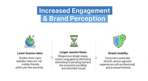
Responsive design is more than resizing elements—it’s about creating an enhanced user experience that meets modern expectations for usability and accessibility.
Equally important is accessibility, which is not just a best practice but increasingly a ranking factor. Standards like the Web Content Accessibility Guidelines (WCAG) emphasize inclusive design, ensuring that people with disabilities can navigate and engage with websites. Features such as proper color contrast, keyboard navigation, and screen reader compatibility are integral to both user satisfaction and compliance with global accessibility laws.
By prioritizing usability and accessibility within a responsive framework, businesses deliver experiences that are frictionless, inclusive, and trusted—all of which directly impact engagement and conversions.
Google officially switched to mobile-first indexing, meaning the mobile version of a website is considered the primary version for ranking. If a site is not optimized for mobile, it risks losing visibility, regardless of how polished the desktop design may be.
By embracing responsive design, businesses align with Google’s indexing model, ensuring their content is accessible, crawlable, and ranked fairly in mobile-dominated search results.
Google’s Core Web Vitals—Largest Contentful Paint (LCP), First Input Delay (FID), and Cumulative Layout Shift (CLS)—measure the speed, interactivity, and stability of a website. These metrics are part of the Page Experience signal and have a direct impact on rankings.
In a competitive landscape, even milliseconds matter. Sites that meet Core Web Vitals not only rank higher but also provide the frictionless experiences users expect.
Accessibility has moved from being a recommendation to becoming a ranking consideration. Search engines now prioritize websites that provide inclusive digital experiences, aligning with global standards like WCAG (Web Content Accessibility Guidelines).
Responsive design plays a key role in accessibility by ensuring that content, navigation, and visuals adjust intuitively for all users, regardless of their device or abilities. Together, mobile SEO, performance optimization, and accessibility form a powerful trio. A responsive website doesn’t just adapt—it performs better, ranks higher, and earns greater trust from both users and search engines.
Responsive websites are favored by Google because they eliminate duplicate content issues (separate mobile vs. desktop URLs) and streamline crawling efficiency. This results in:
Ultimately, responsive design isn’t a design trend—it’s a strategic business investment. It strengthens brand trust, improves rankings, and translates directly into higher conversions and revenue.
Responsive design begins with a strong technical foundation:
Good design is just as crucial as technical execution. Today’s users expect interfaces that are intuitive and easy to interact with:
CSS max-width: 100% prevent images from overflowing on mobile screens.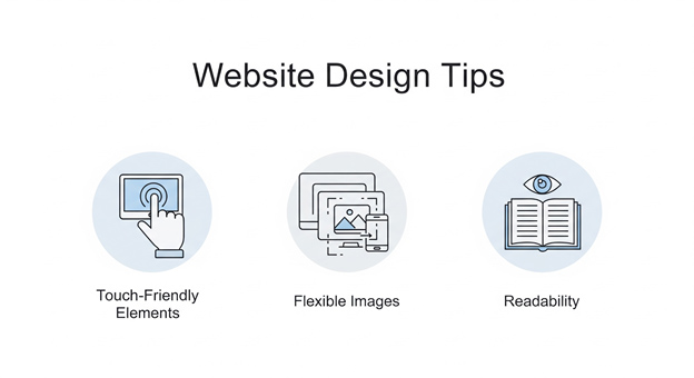
While media queries target viewport dimensions, they don’t always address modular design needs. This is where element queries come in:
By blending traditional responsive techniques with emerging modular strategies, developers can future-proof websites for new devices and design patterns.
As search engines evolve into AI-driven assistants, content must be structured not only for humans but also for algorithms that extract, summarize, and cite information. To stand out in AI Mode, businesses need content that is clear, authoritative, and optimized for machine parsing.
This formatting increases the likelihood of your content being cited in AI overviews and zero-click answers.
AI-powered search thrives on natural, conversational content. Adding Q&A sections helps target long-tail, voice-style queries such as:
By structuring FAQs directly into your blog, you make it easier for AI engines to lift answers verbatim and present your site as a cited authority.
Additionally, infographics, charts, and annotated visuals are increasingly cited by AI systems. Clear labeling and descriptive alt text improve the odds of visuals being referenced in overviews.
This builds credibility not just for readers, but for algorithms evaluating whether your site deserves to be cited.
This internal linking strategy signals expertise and helps AI engines understand your site as a comprehensive authority on a subject area.
Beyond aesthetics and adaptability, the importance of web hosting types and services lies in the fact that a website's performance is naturally linked to the quality of web hosting. In the vast web hosting ecosystem, various types and services cater to different needs. Cloud hosting, dedicated hosting, and shared hosting are among the numerous options available. Each comes with its own set of advantages and limitations.
Shared hosting, where multiple websites share resources on a single server, is a cost-effective option suitable for smaller websites. However, it may lead to slower loading times and less reliability, impacting the user experience. On the other hand, dedicated hosting allocates an entire server to a single website, ensuring optimal performance and faster loading times. This option is ideal for larger websites with high traffic volumes.
Cloud hosting, a scalable and flexible solution, distributes website data across multiple servers, minimizing downtime and enhancing reliability. BUD recognizes that the choice of web hosting depends on factors such as website size, traffic, and budget. Investing in the right hosting solution complements the efforts put into responsive design, creating a harmonious online presence also refer to our related blog ‘Comparing Hosting Services’ to get a clear idea about the hosting services.
The future of digital marketing lies at the intersection of responsive web design (RWD) and AI-driven SEO. As Google and other platforms shift toward AI-powered search experiences, businesses must rethink how visibility is achieved. The focus is moving beyond just clicks—it’s about being cited as a trusted source within AI overviews and conversational results.
Google’s AI Mode, introduced in 2025, is fundamentally changing how content surfaces in search. Instead of presenting users with a list of clickable links, AI Overviews summarize answers directly on the search page, citing sources inline.
This shift means businesses can no longer rely solely on traditional click-throughs for visibility. Success now depends on:
For brands, this creates a new visibility model—being cited as the authority within AI-generated answers, even when users don’t click through. Responsive design ensures the cited page offers a flawless user experience when visitors do land on it, maintaining trust and credibility.
The rise of zero-click searches—where users find their answers directly on search pages without visiting a website— is accelerating with AI integration. While this may reduce raw traffic numbers, it doesn’t have to mean lost opportunities. Businesses can still “win” by shifting their strategy:
In this evolving search ecosystem, success is measured not just by clicks but by citations, mentions, and perceived authority. Businesses that embrace responsive design alongside AI-optimized SEO will remain future-proof in a zero-click world.
The importance of responsive design in advertising is not just a trend; it's a strategic imperative. BUD, a Web development company in Bangalore understands that a website serves as the initial point of contact between a brand and its audience.
Responsive Philosophy would be declared a standard for websites as we have seen Google rating websites in their search results based on mobile-friendly tests and in future it would rate websites as human-friendly, websites which would layout and shape their content based on user preferences, user behaviour, location, age, gender and cultural values.
Prioritizing responsive design and mobile-friendliness, coupled with judicious web hosting choices, ensures that clients of BUD ad agency not only captivate their target audience but also convert that attention into tangible results. In the dynamic realm of digital advertising, responsiveness isn't just a feature; it's the backbone that propels brands towards success in the online marketplace.
WE ARE AN OFFICIAL GOOGLE PREMIER PARTNER